
Wednesday, December 31, 2014
Friday, November 14, 2014
The beauty of sound waves.
As I was browsing through some mesmerizing attempts of visualizing sound waves, the feeling of excitement that I get when I feel I want to share my discoveries here, has finally been awakened again. This feeling has been asleep for some months now and it felt so good to have it back. So lets start with the ride.
"))))) repetition at my distance" is an installation piece by an artist Gabey Tjon a Tham in which she represents her own interpretation of sound waves that she transforms into twists of blue lights.

The piece is composed of sixteen rotating vertical light wires that carry the patterns through the space as audio plays in the background. The beautiful part is that the streams of light respond to increasing and decreasing vibrations of air that comes out of the speakers.


Fabian placed hundreds of colorful tiny crystals on thin plastic foil which he mounted on top of the membrane of a common speaker. Once the sound was played through the speaker, the vibrations would make the crystals start "dancing", forming different shapes, depending on the frequency, pitch and volume of the tone. These figures are formed and last for just a split of a second which Fabian manages to capture.
All this led to a magnificent discovery of power of sound waves which I wasn't aware of until now: Sonoluminescence. Practically it is the production of light from sound. This phenomena was first discovered in 1934. but up to today is a mystery since no one can explain why it happens. The process occurs when an underwater bubble collapses with a sound wave. In that second a beautiful star-like glowing light is produced. What is fascinating about this phenomena is the temperature that collapsing bubble reaches. Scientists suggest it might be up to 10 times hotter than the surface of the Sun. (!)
"))))) repetition at my distance" is an installation piece by an artist Gabey Tjon a Tham in which she represents her own interpretation of sound waves that she transforms into twists of blue lights.
 |
| via http://www.gabeytjonatham.com/ |
Photographer Fabian Oefner had a more direct approach in visualizing sound waves but as equally mesmerizing as Gabey Tjon a Tham's piece. His project is called "Dancing Colors".
 |
| via http://fabianoefner.com |
All this led to a magnificent discovery of power of sound waves which I wasn't aware of until now: Sonoluminescence. Practically it is the production of light from sound. This phenomena was first discovered in 1934. but up to today is a mystery since no one can explain why it happens. The process occurs when an underwater bubble collapses with a sound wave. In that second a beautiful star-like glowing light is produced. What is fascinating about this phenomena is the temperature that collapsing bubble reaches. Scientists suggest it might be up to 10 times hotter than the surface of the Sun. (!)
Tuesday, July 29, 2014
Do computers dream of electric sheep?
Electric Sheep is a beautiful ,continually evolving, animation project started by Scott Draves a.k.a. Spot. Man and machine work together to create a form of artificial life. Electric Sheep is a software that can be installed on any PC or MAC and nowadays Android or iPhone, which starts once the computer goes to sleep mode. At that point computer connects to Electric Sheep server and works along with other participating user's computers from all over Internet, to help create complex rendered animations - screensavers called "sheep". Each computer actually renders one frame of information and sends it back to the server so the sheep is created using all these different information- small dots which form an image. Human participants decide on survival of "sheep" by voting for their favorite screensavers. This way more popular sheep live longer and thus, they get a chance to reproduce according to a genetic algorithm with mutations and cross-overs.
I love the fact that Scott Draves decided to give up control and let things develop by chance. He admits that most of the popular sheep isn't aesthetically pleasing to him because usually flashy, brightly colored sheep get the most votes. But still, he doesn't force it to follow his aesthetics which is really something to admire because it's so hard to do that. For the purposes of satisfying his own aesthetics, he started a new project, the less popular one, called "Dreams in High Fidelity" which is practically the limited edition of Electric Sheep that he curates.
 |
Electric Sheep - Generation 244 - Sheep 59383,birth: Wed Feb 15 06:29:31 2012death: Thu Feb 23 02:20:32 2012 |
 |
Electric Sheep - Generation 244 - Sheep 23705,birth: Sat Oct 30 07:42:11 2010death: Sun Nov 14 02:20:22 2010 |
 |
Electric Sheep - Generation 244 - Sheep 80628,birth: Thu Oct 31 13:45:32 2013death: Fri Nov 8 09:17:22 2013 |
I love the fact that Scott Draves decided to give up control and let things develop by chance. He admits that most of the popular sheep isn't aesthetically pleasing to him because usually flashy, brightly colored sheep get the most votes. But still, he doesn't force it to follow his aesthetics which is really something to admire because it's so hard to do that. For the purposes of satisfying his own aesthetics, he started a new project, the less popular one, called "Dreams in High Fidelity" which is practically the limited edition of Electric Sheep that he curates.
Monday, June 30, 2014
Mise en abyme.
We all get trapped by physical seduction but there is always an infinite number of layers that we should try to discover and explore because there lies the true beauty. Somehow to me "mise en abyme" reflects this thought in a perfect way. It is a French term that literally means "placed into abyss" or placing into infinity which is physically the most similar to feeling when standing between two mirrors. I've been obsessing over exploring "mise en abyme" and realized that examples of it can be found everywhere: in literature, art, film, photography because the rules about "infinity" part are not that strict as most of the plays within plays, paintings within paintings, stories within stories, pictures within pictures, dreams within dreams are considered to be mise en abyme.
During my digging on the subject, I found this photograph by Alain Fleischer and instantly fell in love with it, even though it's not the perfect example of "mise en abyme" but I love its playfulness on the subject.
One of the wittiest examples that I've stumbled upon is Pink Floyd's cover for their album from 1969. - "Ummagumma" . On the first impression, it looks as if the same image is reflected in the mirror over and over again but if you look closely, you notice that the band members switch positions in each image.
So back to my first thought...In order to explore and discover all those layers, I guess one should place something into infinity. However, brilliant scene from "Escape from the Planet of the Apes" where they explain infinite regression, adds an important detail to this. Quantic sampled it in such a great way:
So infinite regression is--
--It is the moment when our artist,
having regressed to the point of
infinity, himself becomes a part
of the picture he has painted and
is both the Observer and the observed.
 |
| Alain Fleischer - Dans le cadre du miroir, 1984. |
During my digging on the subject, I found this photograph by Alain Fleischer and instantly fell in love with it, even though it's not the perfect example of "mise en abyme" but I love its playfulness on the subject.
One of the wittiest examples that I've stumbled upon is Pink Floyd's cover for their album from 1969. - "Ummagumma" . On the first impression, it looks as if the same image is reflected in the mirror over and over again but if you look closely, you notice that the band members switch positions in each image.
 |
| Pink Floyd's cover for "Ummagumma", 1969. |
So back to my first thought...In order to explore and discover all those layers, I guess one should place something into infinity. However, brilliant scene from "Escape from the Planet of the Apes" where they explain infinite regression, adds an important detail to this. Quantic sampled it in such a great way:
So infinite regression is--
--It is the moment when our artist,
having regressed to the point of
infinity, himself becomes a part
of the picture he has painted and
is both the Observer and the observed.
Thursday, May 29, 2014
Oh, that precious bird's-eye view.
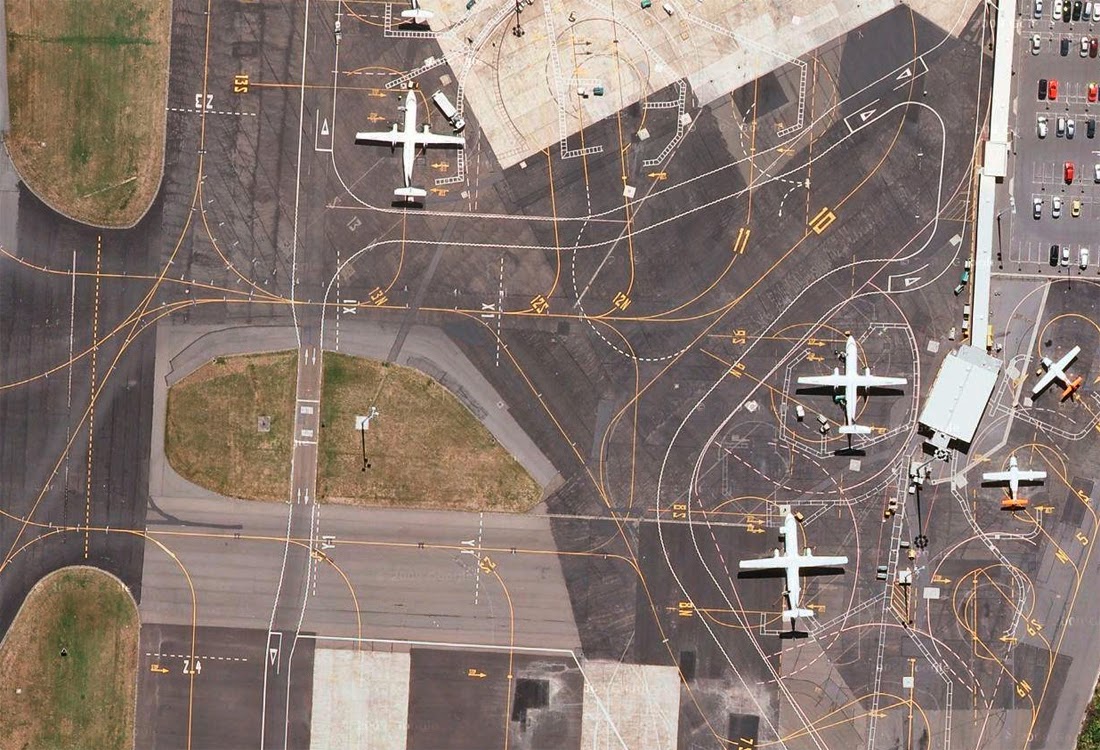
I've always been fascinated by airports. I think what impresses me about them the most is that they remind me of some giant living organisms, taking planes in and dispatching them. These perfectly organized systems are built according to various rules and regulations and have a stunning number of markings and signs which most of the people are completely unaware of.
Naturally, I'm not alone in this fascination but a person who acted upon it in a really peculiar way is Lauren O'Neill, a graphic designer and an art director who started a project named Holding Pattern. Of course I instantly fell in love with it. Lauren collects satellite images of airports using Google Maps. Her curiosity takes her to zooming on various airports across the globe and her intuition for beautiful leads her to cropping the perfect image.
These images really put things in another perspective and reveal the logic behind all those signs and lines we see at the airports. Lauren's project has driven me into compiling a small list of the facts related to airports and runways which I became aware of quite late in my life. Some of you might find it useful and some will probably just find it silly.
1.Yellow lines and markings are used on taxiways and white ones are used on the runways BUT in Norway and some other countries yellow lines and markings are used on the runways instead of the usual white ones, in order to make the better contrast against the snow.
2. Runways are named by a number between 01 and 36. These numbers actually tell you to which direction the runway points. For example, runway numbered 36 points to the north ( 360°) , runway 18 points to the south (180°), runway 09 points to the east (90°), runway 27 points to the west (270°).
3. Every runway has a distinctive marking of the threshold which tells the pilot that it is the safest part of the runway for touching the ground when landing a plane.
4. By night, each of those different colored flashing lights has its own role. Blue lights run alongside taxiways and white or yellow run alongside runways. Also, green lights mark the beginning while red indicate the end of the runway.
I'll finish off with few more loving images from Holding Pattern.
Naturally, I'm not alone in this fascination but a person who acted upon it in a really peculiar way is Lauren O'Neill, a graphic designer and an art director who started a project named Holding Pattern. Of course I instantly fell in love with it. Lauren collects satellite images of airports using Google Maps. Her curiosity takes her to zooming on various airports across the globe and her intuition for beautiful leads her to cropping the perfect image.
 |
| London Heathrow Airport, via Holding Pattern |
 |
| Wellington International Airport, via Holding Pattern |
 |
| McCarran International Airport, via Holding Pattern |
These images really put things in another perspective and reveal the logic behind all those signs and lines we see at the airports. Lauren's project has driven me into compiling a small list of the facts related to airports and runways which I became aware of quite late in my life. Some of you might find it useful and some will probably just find it silly.
1.Yellow lines and markings are used on taxiways and white ones are used on the runways BUT in Norway and some other countries yellow lines and markings are used on the runways instead of the usual white ones, in order to make the better contrast against the snow.
2. Runways are named by a number between 01 and 36. These numbers actually tell you to which direction the runway points. For example, runway numbered 36 points to the north ( 360°) , runway 18 points to the south (180°), runway 09 points to the east (90°), runway 27 points to the west (270°).
3. Every runway has a distinctive marking of the threshold which tells the pilot that it is the safest part of the runway for touching the ground when landing a plane.
4. By night, each of those different colored flashing lights has its own role. Blue lights run alongside taxiways and white or yellow run alongside runways. Also, green lights mark the beginning while red indicate the end of the runway.
I'll finish off with few more loving images from Holding Pattern.
 |
| Madrid–Barajas Airport, via Holding Pattern |
 |
| Newark Liberty International Airport, via Holding Pattern |
Wednesday, May 7, 2014
Curved folding.
 |
| erikdemaine.org |
This stunning paper sculpture is a work by Erik and Martin Demaine, the intriguing father and son duo.The Demaines share the equal amount of love for both mathematics and art, so with that love come the endless explorations and intersections of these two fields. The sculptures that the Demaines produce are self-folding origami or as they call them, the curved-crease sculptures, where the creases in paper actually cause the sculpture to fold into complex forms.
The explorations of the curved crease began with the Bauhaus (natürlich!) and Josef Albers, a charismatic teacher of preliminary course in paper study at Bauhaus, who insisted on students investigating the properties of the material used for making sculptures. And so, one of the students ended up making the simple, yet beautiful model: a circular piece of paper folded along the concentric circles where the final pleated form automatically twists into curve.
 |
| from the book "Bauhaus:Weimer,Dessau,Berlin,Chicago" by Hans M.Wingler |
Eric and Martin pushed their explorations much further, building large sculptures, using many smaller elements with various types of curves. Their pieces look alive to me. They are geometrically logical, clean and ordered and at the same time unexpected and chaotic. I guess this is the reason why they are hypnotically beautiful.


 |
| erikdemaine.org |
Thursday, March 27, 2014
Thanks for all the fish.
My obsession with the fish as one of my favorite beings on this planet, crawled upon me once again as I was going through the work of Sandy Skoglund.
 |
| Sandy Skoglund, Revenge of the Goldfish, 1981. |
I am not a big fan of staged photography but I love Sandy's work. I love her preciseness, attention to detail and hypnotic repetition. Most of all I love the fact that whenever she talks about her art, she points out that there is no greater purpose to it. Whenever critics try to interpret her work as her attempt to highlight society's contemporary problems, she just dismisses those and explains that she is not trying to create "high art" but just art filled with emotional intensity.
She usually spends half a year imagining the scene, developing her idea, designing every single element by herself and when she finishes her installation, she sets the lighting and takes the photo. This makes her a script writer, a stage designer, a sculptor, a painter and a photographer at the same time, which is pretty impressive.
While looking at Sandy's "Revenge of the goldfish" , I remembered another artwork which gave me that same feeling of odd oscillation between real and surreal and at the same time the perfect flow of the two parallel universes. I had hard times finding it again because I didn't know the name of the author but thanks to the mighty Google, I've managed to trace it down. It's a collage named "In the Pisces Constellation" from 1963. by Adolf Hoffmeister.
 |
| Adolf Hoffmeister, In the Pisces Constellation, 1963. |
Hoffmeister was "an unconventional spirit"; a poet, a novelist, an editor, a translator, an illustrator, a painter, a stage decorator, a journalist and lots of other things at the same time. I wasn't able to find much info on this Czech avant-gardist but I was impressed with most of his work that I could find online ( here and also here) .
Now fast forwarding to nowadays when someone figured out that the fascination with the fish doesn't necessarily mean that you need to trap the real fish in a fish tank and put them in your living room.
Interactive Fish Tank is an installation which explores water-based touch displays developed by two students at NYU, Manuela Donoso and Crys Moore in 2011. With this virtual aquarium, one can interact with the pixelated goldfish, thus destroying the boundary between real and virtual (surreal).
Saturday, March 1, 2014
Flow.


 |
| Karl Blossfeldt, photos via phlearn |
I find solace in looking at Karl Blossfeldt's photographs of plants.
Blossfeldt was a German sculptor, teacher and a self-taught photographer. He photographed nothing but blossoms, leaves, buds and seed-capsules for 35 years. Blossfeldt primarily made and used these photos for educational purposes. He wanted to show his students that the best design solutions already exist in nature and one only needs to look closely at them. He claimed that in plants one can find not only functionality but also the highest aesthetic forms.
Blossfeldt's photos were published in a book "Urformen der Kunst" when he was already 61 years old and this was the turning point for him as this publication practically made him famous overnight.
Flow ( or flOw) is a video-game which awakes the exact same feeling in me as going through Karl Blossfeldt's photos.

 |
| flOw screenshots |
Flow was created by Jenova Chen and Nicholas Clark in 2006. as a free Flash game and has later been reworked to be suited for playing on Sony PlayStations. The game takes place in aquatic environment where the player is an organism that moves and feeds on other organisms. If you prefer, you may also choose to just float around and not interact with other creatures. You can try out the game here.
Flow is about surviving and also evolving. It is visually so exceptional that it completely absorbs you into the depths of deep blue water, just as Karl Blossfeldt's photos absorb you into familiar, yet alien-like, forms of the world of plants.The perfect flow.
Friday, January 31, 2014
Silence.
The most silent place on Earth at the moment seems to be a room in Minneapolis- an anechoic chamber at Orfield Labs. The anechoic chambers are rooms which are completely isolated from outside noise and are designed in a way that they absorb sound without reflecting any back into the room. There are many anechoic chambers in the world but what makes the one at Orfield Labs "the quietest" is the fact that the noise level measured in the anechoic chambers is usually around 10 dBA and in the one in Minneapolis is -9,4 dBA. The human ear detects sounds above 0 dBA.
 |
| © Orfield Labs |
When one spends some time in this room, one would expect to experience the absolute silence. But although one experiences the total absence of sound outside the body, one becomes extremely aware of the sounds inside our bodies- the heart beat, the sound of lungs as you inflate and deflate, the pulse of blood through veins and arteries. These sounds become so disturbing that no person so far could stand to be in this room for more than 45 minutes. People usually experience disorientation and visual and auditory hallucinations.
It is exactly this experience - the visit to one of the anechoic chambers, that made John Cage write the famous piece 4'33". His search for "nothingness", for the absolute silence, for Zen in music, led him to the anechoic room where he was utterly surprised to hear sounds, realizing those were the sounds of his own body. This experience had such a profound effect on Cage, helping him understand that "there's no such thing as silence".
“There is no such thing as an empty space or an empty time. There is always something to see, something to hear. In fact, try as we may to make a silence, we cannot.”
~John Cage
Subscribe to:
Comments (Atom)